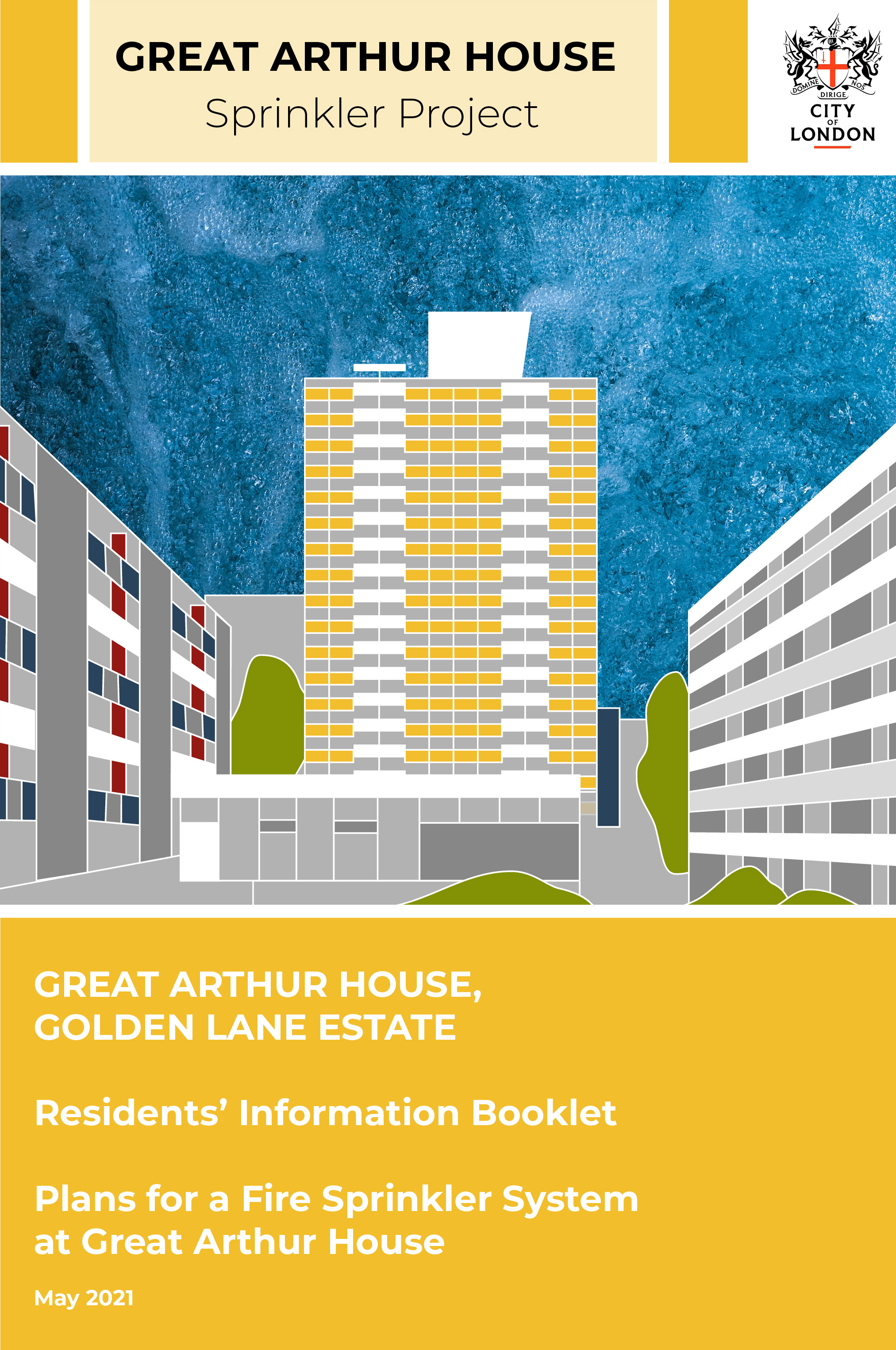
After observing the shapes and colours of Great Arthur House I created a new logo and chose some brand colours. It was important to the client that these fit well with their existing brand and logos.
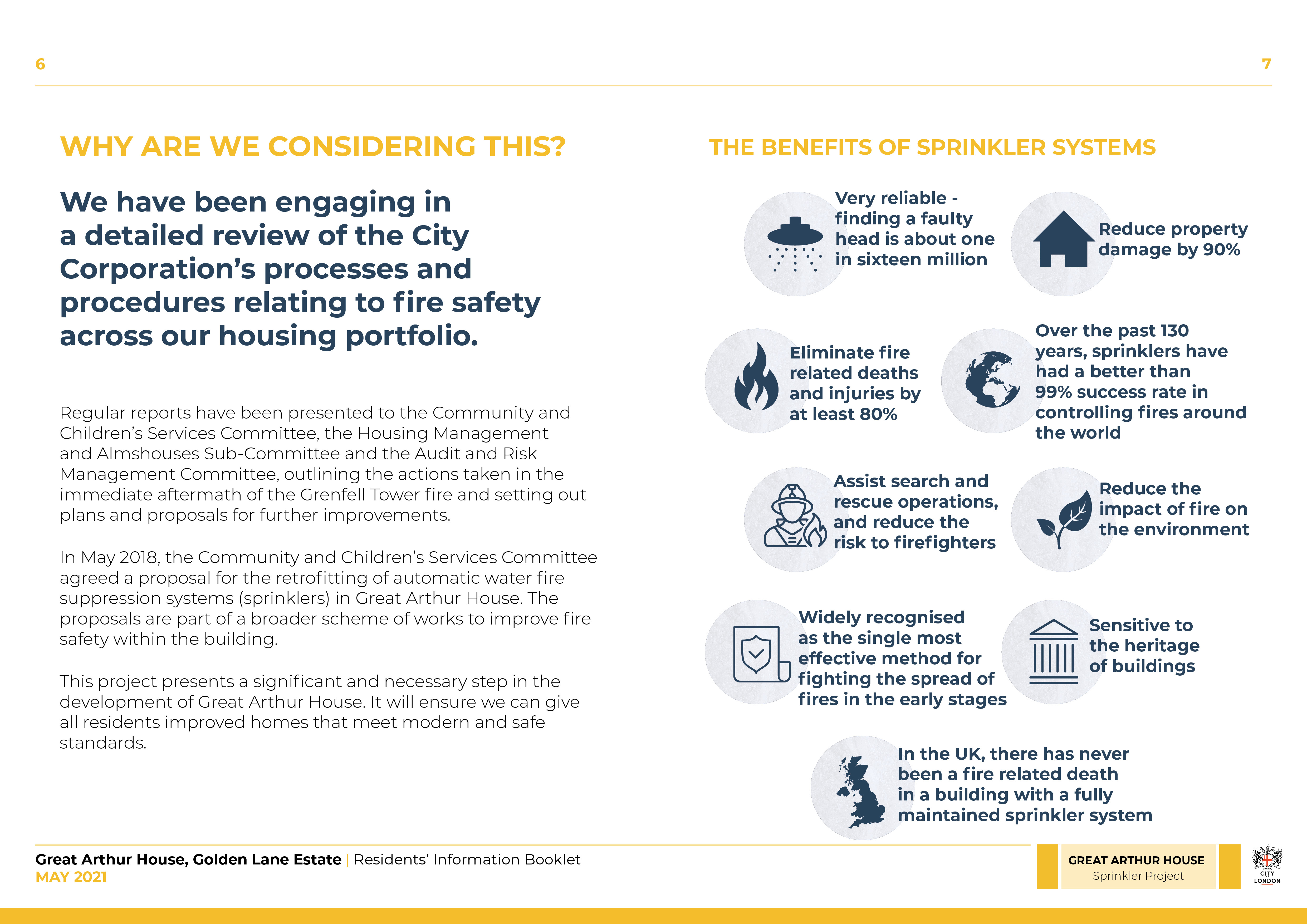
Alongside the project team I suggested a layout for the booklet. We spread the pages out a lot and increased the size of the fonts as we wanted to ensure that it was as accessible to residents as possible.
I used Adobe Illustrator for the cover illustration, maps and icons and InDesign for the layout and typesetting.
︎ Work in Progress